Styles (Legacy)
Warning
Styles are obsolete and no longer supported. They are replaced with UI Themes.
Styles are like skins. They are used to change the Color, Text, and Images options of the widgets.
New UI Widgets contains two predefined styles: Default and Blue.
New style can be created with menu Assets / Create / New UI Widgets / Style.
You can set any style to use as default. Default style will be applied for the created widgets. Also, you can apply style for GameObjects on the scene with UI / New UI Widgets / Apply Default Style.
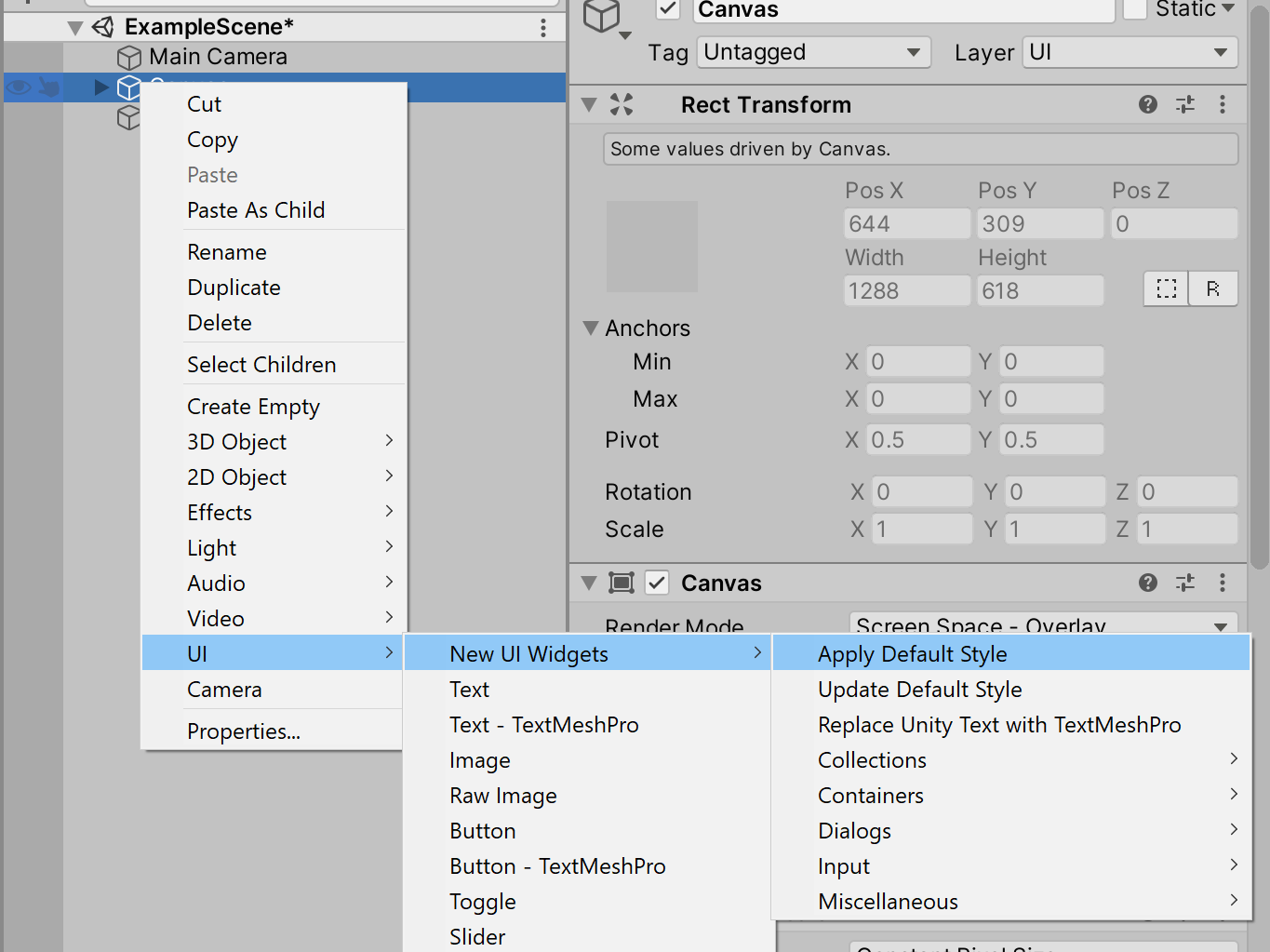
You can change widgets settings and then save them to the style with UI / New UI Widgets / Update Default Style.
Styles has two modes: fast and detailed settings:
Fast allow to quickly set settings for all widgets with Apply Fast Settings button.
Detailed allow to tune settings for each widget type separately.
Note
For the style support for the nested widgets (for example, Switch or Spinner in the ListView.DefaultItem),
you should add the StyleSupportAny component to the GameObject of the parent widget
and specify nested widgets at the Objects field.
Style support for the custom widgets
You can add style support for your widgets with IStylable implementation.
using UIWidgets.Styles;
using UnityEngine;
using UnityEngine.UI;

[RequireComponent(typeof(Image))]
public class CustomPanel : MonoBehaviour, IStylable
{
        public virtual bool SetStyle(Style style)
        {
                style.Collections.MainBackground.ApplyTo(GetComponent<Image>());

                return true; // true if children GameObjects was processed; otherwise false.
        }

        public virtual bool GetStyle(Style style)
        {
                style.Collections.MainBackground.GetFrom(GetComponent<Image>());

                return true; // true if children GameObjects was processed; otherwise false.
        }
}
Note
Widgets created by Widgets Generator already have style support.