ListView, TileView and Table (DataGrid)
Note
Table is ListView with specific DefaultItem and Table Header (it also provides Table specific methods). Widget with scripts should be created by Widgets Generator.
Note
In case of noticeable artifacts when scrolling (these are caused by rounding during rendering), you can increase the font size to reduce the artifacts.
All collections widgets support virtualization: GameObjects created only for the visible items.
Different ListView, TileView and Table can display the same list simultaneously.
In most cases
ToggleGroupandSwitchGroupcomponents used by widgets under DefaultItem hierarchy should be placed outside DefaultItem GameObject. And on value changed callbacks should process all items, not only the current one, since invisible items do not receive callbacks because of the virtualization.
List View Type

ListView with Fixed Size.

ListView with Variable Size.
ListView with Ellipse layout.

TileView with Fixed Size.

TileView with Variable Size.
TileView Staggered.
Note
Dictionary<TItem, Vector2> and different instances of the same item should have the same size.EasyLayout Settings for the Ellipse Type
RectTransform.pivot
Defines on which side or corner will be the center point.
EasyLayout.Ellipse settings
Width and height usually should be specified, set the same value for the circle.
Angle Start
Base rotation for the first item.
Angle Step Auto
Should be disabled.
Angle Step
Angular distance between items.
Fill
Should be
Arc.Arc Length
Should be 180 if center at the side and 90 if center at the corner.
Options
Interactable
boolAllow users interact with the ListView.
Disable ScrollRect
boolIf ListView is disabled then ScrollRect and scrollbars will be disabled too.
Virtualization
boolEnable virtualization. If enabled GameObject instantiated only for the visible items; otherwise for the all items.
List Type
ListViewTypeDetermines how items are displayed.
ListViewWithFixedSizeWorks with EasyLayout, Horizontal Layout Group and Vertical Layout Group.
ListViewWithVariableSizeWorks with EasyLayout, Horizontal Layout Group and Vertical Layout Group.
ListViewEllipseWorks with EasyLayout. Axis of rotation is RectTransform.pivot.It is recommended to use with enabled LoopedList option.TileViewWithFixedSizeWorks with EasyLayout.
TileViewWithVariableSizeWorks with EasyLayout.
TileViewStaggeredWorks with EasyLayout.
ChangeLayoutType
boolEasyLayout settings will be changed according current list type if this option enabled.
StretchToMaxItemSize
boolThis option will stretch ListView to fully display the largest item, and works only withListViewWithVariableSize.Mainly it is used for theCombobox.ListView.PrecalculateItemSizes
bool.When enabled, item sizes are calculated at the start, allowing for precise scrolling. Disabling this option will improve performance.Disable it if any item data (such as sprites) is loaded asynchronously or via lazy loading.Available only for the VariableSize types.Sort
booldeprecatedAvailable only forListViewIcons. If enabled items will be sorted by name.Deprecated, replaced with DataSource.Comparer.SortFunc
Func<IEnumerable<TItem>, IEnumerable<TItem>>deprecatedNot available in the Inspector window Function to sort items. Deprecated, replaced with DataSource.Comparer.
Data Source
ObservableList<TItem>List of the items. It works the same way as List<T> with some additions.Not available in the inspector window if type not specified as serializable.ReversedOrder
boolIf enabled first item will be displayed at the end of the list, initial scroll position also will be at the end.Can be used for horizontal lists in cultures with right-to-left writing directions.Not compatible withTileViewStaggered.Selected Index
intIndex of the last selected item.
Multiple Select
boolAllow to select multiple items, otherwise only one.
Multiple Select Require Keys
boolItems selection will work similarly to file explorer if enabled.
Range Mode
RangeSelectionModeSpecify range selection mode (multiple items selection with
Shiftkey).StartFromFirstSelect all items from the first selected item to the newly selected item.
StartFromLastSelect all items from the last selected item to the newly selected item.
Selected Indices
List<int>Not available in the Inspector window List of the selected items indices.
Selected Item
TItemNot available in the Inspector window Last selected item.
Selected Items
List<TItem>Not available in the Inspector window List of the selected items.
Direction
ListViewDirectionListView direction.
HorizontalVertical
ScrollRect
ScrollRectScrollRect used by ListView. Required for virtualization support.
Container
TransformThe container of the instantiated GameObjects used to display items. Should have layout required for the specified
List Type.SetContentSizeFitter
boolIf enable changes ContentSizeFitter settings according to the selected direction.
Default Item
TComponentA prefab used to display item.
DestroyDefaultItemsCache
boolIf enabled then instances of the previous DefaultItem will be destroyed when
DefaultItemorTemplateSelectorare changed.Allow Coloring
boolChange colors of the highlighted and selected items.If you want to more precise control on item colors, like different colors depending of item data, then you can overrideStateDefault(),StateHighlighted(),StateSelected(), andStateDisabled()methods ofTComponentclass.Coloring Striped
boolUse different background colors for the odd and even items.Colors
Colors for the text and background elements of the DefaultItem instances.
Text and background elements defined with GraphicsForeground and GraphicsBackground properties of the
TComponent.Default Color
ColorDefault Background Color
Color: only if Coloring Striped disabledDefault Odd Background Color
Color: only if Coloring Striped enabledDefault Even Background Color
Color: only if Coloring Striped enabledHighlighted Color
ColorHighlighted Background Color
ColorSelected Color
ColorSelected Background Color
ColorDisabled Color
Color: multiplier for the specified colors if ListView is not interactable, actual color is current color (default, highlighted, selected) * disabled color.
Fade Duration
floatTime for a smooth color change when the state of an element changes.
Keep Highlight
boolKeep item highlight on pointer enter until will be selected another GameObject.
Only One Highlighted
boolAllows only one highlighted item. If disabled then two can be highlighted: first from pointer over, second from navigation by keyboard or gamepad.
Navigation
boolAllow to use navigation with keyboard or gamepad.ListView should have a Selectable component to navigation work properly.Looped Navigation
boolEnables/disables navigation from first to last item and vice versa.
Require Visible
intNumber of visible items from current item to border on navigation.
Style Table
boolIs ListView will be displayed as a table? Used for correct styles support.
Header
TableHeaderDeprecated field and should be used only if legacy styles are enabled.
LocalizationSupport
boolIf enabled item names will be translated withLocalization.GetTranslation()method if localization is used.Available only for theListViewIcons.Can Select
Func<int, bool>The function that determines whether the item with the specified index can be selected. Unselectable items cannot be highlighted and skipped by keyboard and gamepad navigation.
Can Deselect
Func<int, bool>The function that determines whether the item with the specified index can be deselected.
Events
OnSelect
UnityEvent<int, ListViewItem>The event raised when item selected.
Arguments: index of the selected item and DefaultItem instance for the selected item.
OnDeselect
UnityEvent<int, ListViewItem>The event raised when item deselected.
Arguments: index of the deselected item and DefaultItem instance for the deselected item.If an item associated with this index is removed the index can be invalid (>= DataSource.Count) or point to different item.OnSelectObject
UnityEvent<int>The event raised when item selected.
Arguments: index of the selected item.
OnDeselectObject
UnityEvent<int>The event raised when item deselected.
Arguments: index of the deselected item. If an item associated with this index is removed the index can be invalid (
>= DataSource.Count) or point to different item.OnItemSelected
UnityEvent<int, TItem>The event raised when item selected.
Arguments: index of the selected item and selected item.
OnItemDeselected
UnityEvent<int, TItem>The event raised when item deselected.
Arguments: index of the deselected item and deselected item. | If an item associated with this index is removed the index can be invalid (
>= DataSource.Count) or point to different item. | The item is not valid if list is cleared or selected item was removed.OnItemDropped
UnityEvent<int, TItem>The event raised when item dropped.
Arguments: index of the selected item and selected item.
OnStartScrolling
UnityEventThe event raised when scrolling starts.
OnEndScrolling
UnityEventThe event raised when after End Scroll Delay from left last scroll event.
onSubmit
UnityEventThe event raised when ListView GameObject has been selected via a “submit” key you specify (default is the return key).
onCancel
UnityEventThe event raised when ListView GameObject has been deselected.
onItemSelect
UnityEventThe event raised when ListView item GameObject has been selected via a “submit” key you specify (default is the return key).
onItemCancel
UnityEventThe event raised when ListView item GameObject has been deselected.
OnUpdateView
UnityEventThe event raised when ListView view was updated.
OnFocusIn
UnityEvent<BaseEventData>The event raised when ListView GameObject received focus.
OnFocusOut
UnityEvent<BaseEventData>The event raised when ListView GameObject lost focus.
OnPointerEnterObject
UnityEvent<int>The event raised when pointer entered on ListView item GameObject.
Arguments: index of the item.
OnPointerExitObject
UnityEvent<int>The event raised when pointer exited on ListView item GameObject.
Arguments: index of the item.
OnDataSourceChanged
UnityEvent<ListViewCustom<TComponent, TItem>>The event raised when DataSource replaced with the new list.
Arguments: ListView instance.
Items Events
It is ListView.ItemsEvents field with list of items events.
First argument is item index, second is item instance instance, third is event data.
PointerClick
UnityEvent<int, ListViewItem, PointerEventData>The event raised on every pointer click on item instance.
FirstClick
UnityEvent<int, ListViewItem, PointerEventData>The event raised on first pointer click with left mouse button on item instance.
DoubleClick
UnityEvent<int, ListViewItem, PointerEventData>The event raised on second pointer click with left mouse button on item instance.
PointerUp
UnityEvent<int, ListViewItem, PointerEventData>The event raised on pointer up on item instance.
PointerDown
UnityEvent<int, ListViewItem, PointerEventData>The event raised on pointer down on item instance.
PointerEnter
UnityEvent<int, ListViewItem, PointerEventData>The event raised on pointer enter on item instance.
PointerExit
UnityEvent<int, ListViewItem, PointerEventData>The event raised on pointer exit on item instance.
Move
UnityEvent<int, ListViewItem, AxisEventData>The event raised on move with keyboard or gamepad on item instance.
Submit
UnityEvent<int, ListViewItem, BaseEventData>The event raised on submit on item instance.
Cancel
UnityEvent<int, ListViewItem, BaseEventData>The event raised on cancel on item instance.
Select
UnityEvent<int, ListViewItem, BaseEventData>The event raised when item instance has been selected by EventSystem.
Deselect
UnityEvent<int, ListViewItem, BaseEventData>The event raised when item instance has been deselected by EventSystem.
Resize
UnityEvent<int, ListViewItem, Vector2>The event raised when item instance size was changed.
MovedToCache
UnityEvent<ListViewItem>The event raised before item instance recycled.Use this event to clean data, unload sprites, stop instance animations.
ListViewComponent Class
Component to display item.
Fields and properties
Index
intIndex of the displayed item. Negative if item not displayed or not used by ListView.
Owner
ListViewBaseReference to ListView.
DisableRecycling
boolDisable recycling of this instance. Used in Drag&Drop or animations (enable at the start of the animation and disable at the end).
GraphicsForeground
Graphic[]References to the foreground GameObjects like Text.
GraphicsBackground
Graphic[]References to the background GameObjects.
DisableRecycling
boolIf enabled prevent instance recycling until this option is disabled.
Methods
SetData(
TItemitem)Set data to display.This method can be called whenIndex < 0ifListTypeis variable size andPrecalculateItemSizesenabled to calculate the exact size of the itemsCheck thatIndex >= 0if there is need to do some additional actions only if item actually displayed.SelectItem()
Select current item.
DeselectItem()
Deselect current item.
RemoveItem()
Remove current item from the ListView.DataSource.
GraphicsColoring(
ColorforegroundColor,ColorbackgroundColor,floatfadeDuration)Called by ListView to set colors for the GraphicsForeground and GraphicsBackground.
MovedToCache()
Called by ListView when GameObject moved to cache or recycled to unload unused resources like sprites.
StateDefault()
Called by ListView when item in the default state.
StateSelected()
Called by ListView when item selected.
StateHighlighted()
Called by ListView when item highlighted.
Vector2GetInstanceSize(intindex)Get the size of the instance for the item with the specified index. Used to animate items resize without problems with virtualization.
SetInstanceSize(
intindex,Vector2size)Set the size of the instance for the item with the specified index.
UpdateView()should be called after it to apply changes. Used to animate items resize without problems with virtualization.ResetInstanceSize(
intindex)Reset the size to the default for the item with the specified index.
UpdateView()should be called after it to apply changes. Used to animate items resize without problems with virtualization.
Auto-Resize DefaultItem Instances on ListView Resize and Keep Aspect Ratio
ListView with Items of Variable Size
ListView and TileView can display items with different heights or widths (it cannot be both at the same time).
- ListView.DefaultItem: add layout group component (it can be
Horizontal Layout Group,Vertical Layout Group, orEasyLayout) in case of
Horizontal Layout GrouporVertical Layout Group: enableHeightforControl Child Size, specifyPaddingandSpacingif needed.in case of
EasyLayout: changeChildren HeighttoSet Preferred, specifyMarginandSpacingif needed.
If the ListView
DirectionisHorizontalthen use width related options instead of height.LayoutElementcomponent can be to DefaultItem to specify minimal width or height and other options.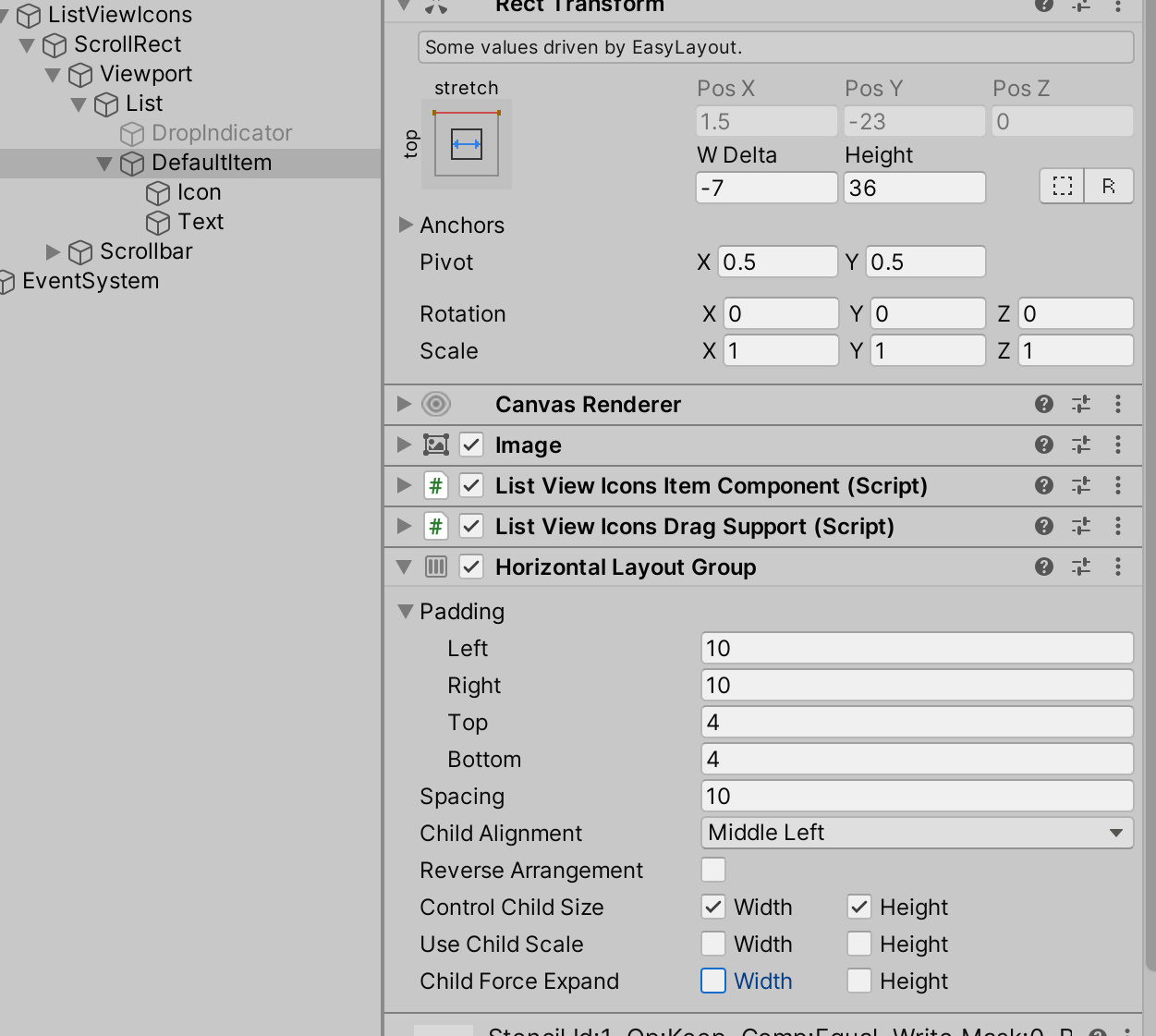
- ListView.DefaultItem: add layout group component (it can be
- ListView.Container: change
Children HeighttoSet PreferredinEasyLayoutcomponent 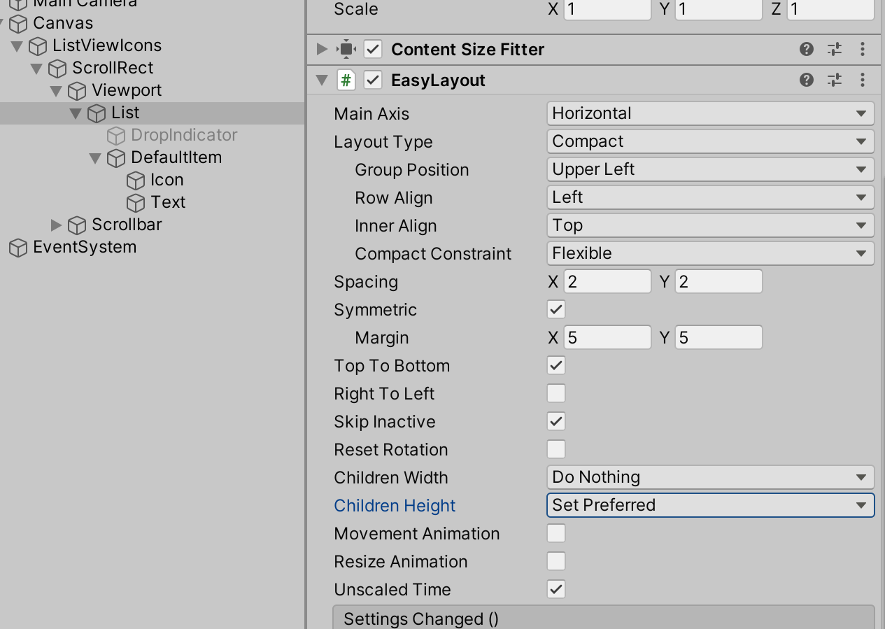
- ListView.Container: change
- 3 ListView: change
List TypetoList View With Variable Size,Tile View With Variable Size, orTile View Staggered 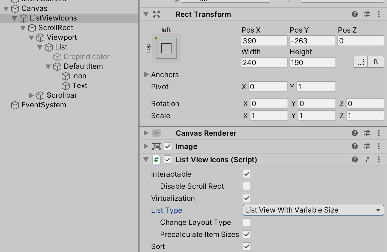
Layout group will resize nested GameObjects and determine the size of each item.
EasyLayout will resize those items and ListView will correctly process items with different sizes.
Multiple DefaultItems
You can create a component with the IListViewTemplateSelector<TComponent, TItem> interface implementation and add this component to the widget.
Note
TemplateSelector property, which can be used to specify template selectors.namespace UIWidgets.Examples
{
using UnityEngine;
public class GroupMultipleListViewSelector : MonoBehaviour, IListViewTemplateSelector<GroupMultipleComponent, GroupMultipleItem>
{
[SerializeField]
public GroupMultipleComponent GroupTemplate;
[SerializeField]
public GroupMultipleComponent CheckboxTemplate;
[SerializeField]
public GroupMultipleComponent ValueTemplate;
public GroupMultipleComponent[] AllTemplates()
{
return new[] { GroupTemplate, CheckboxTemplate, ValueTemplate };
}
public GroupMultipleComponent Select(int index, GroupMultipleItem item)
{
switch (item.Mode)
{
case GroupMultipleItem.ItemMode.Group:
return GroupTemplate;
case GroupMultipleItem.ItemMode.Checkbox:
return CheckboxTemplate;
case GroupMultipleItem.ItemMode.Value:
return ValueTemplate;
}
throw new ArgumentOutOfRangeException(nameof(item), item.Mode, "Unsupported Item Mode");
}
}
}
IListViewTemplateSelector Interface
Methods:
TComponent[]AllTemplates()Get all possible templates.
TComponentSelect(intindex,TItemitem);Returns template to use for specified item with index.
DefaultItem Instances
// also available .Active and .Cache modes
foreach (var instance in ListView.GetComponentsEnumerator(PoolEnumeratorMode.All))
{
        // do something with DefaultItem instance
}
Add Item
var new_item = new ListViewIconsItemDescription()
{
        Icon = sampleIcon,
        Name = "test item",
};
listView.DataSource.Add(new_item);
Get Items
var items = listView.DataSource;
Set Items
var items = new ObservableList<ListViewIconsItemDescription>();
listView.DataSource = items;

var items2 = new List<ListViewIconsItemDescription>();
listView.DataSource = items2.ToObservableList();
Display Same List with ListView, TileView or Table
var items = new ObservableList<ListViewIconsItemDescription>();
listView.DataSource = items;
tileView.DataSource = items;
table.DataSource = items;
Get Last Selected Index
Debug.Log(listView.SelectedIndex);
Get Selected Indices
var indices = listView.SelectedIndices;
Debug.Log(string.Join(", ", indices.ConvertAll(x => x.ToString()).ToArray()));
Last Selected Item
Debug.Log(listView.SelectedItem.Name);
Get Selected Items
var selected_items = listView.SelectedItems;
Debug.Log(string.Join(", ", selected_items.ConvertAll(x => x.Name).ToArray()));
Delete Specified Item
listView.DataSource.Remove(items[0]);
Delete Item by Index
listView.DataSource.RemoveAt(0);
Clear List
listView.DataSource.Clear();
Add Items
var new_items = new List<ListViewIconsItemDescription>()
{
        new_item,
        new_item,
        new_item,
};
listView.DataSource.AddRange(new_items);
Optimization
// Use BeginUpdate() and EndUpdate() to keep widget from updating on each change.
// All changes after BeginUpdate() call will be displayed with EndUpdate() call
// or after value returned by BeginUpdate() was disposed.

void AddItems()
{
        var items = listView.DataSource;
        using var _ = items.BeginUpdate();

        items.Clear();
        items.Add(new_item);
        items.Add(new_item);
        items.Add(new_item);
        items.AddRange(new_items);
        items.RemoveAt(0);

        // widget will be updated at function end
}

void AddItemsV2()
{
        var items = listView.DataSource;
        using (var _ = items.BeginUpdate())
        {
                items.Clear();
                items.Add(new_item);
                items.Add(new_item);
                items.Add(new_item);
                items.AddRange(new_items);
                items.RemoveAt(0);
        } // widget will be updated at end of the 'using' block

        // .., other code
}
Replace Item
listView.DataSource[0] = new ListViewIconsItemDescription()
{
        Name = "new item"
};
Sort
// Sort by LocalizedName or Name in ascending order
Comparison<ListViewIconsItemDescription> ItemsComparisonAsc = (x, y) => x.Name.CompareTo(y.Name);

// sort by LocalizedName or Name in descending order
Comparison<ListViewIconsItemDescription> ItemsComparisonDesc = (x, y) => -(x.Name).CompareTo(y.Name);

// sort items only once
items.Sort(ItemsComparisonAsc);
Enable Permanent Sort
items.Comparison = ItemsComparisonDesc;
Important
Items will be always sorted, but if you use .BeginUpdate() then items will be re-sorted only after .EndUpdate() call or after value returned by BeginUpdate() was disposed.
Disable Permanent Sort
items.Comparison = null;
Set Selected Index
listView.SelectedIndex = 1;
Or:
listView.Select(1);
Behavior is different if you enable MultipleSelect:
listView.SelectedIndex = 1last selected item will be deselected and specified item will be selected.listView.Select(1)new item will be added to selected items.
Deselect
listView.SelectedIndex = -1;
Or:
listView.Deselect(1);
Adding Callbacks to Custom Events of the Components
public class YourListView : ListViewCustom<YourListViewItemComponent, YourListViewItem>
{
        protected override void AddCallback(ListViewItem item)
        {
                base.AddCallback(item);
                item.onDoubleClick.AddListener(ProcessDoubleClick);
        }

        protected override void RemoveCallback(ListViewItem item)
        {
                base.RemoveCallback(item);
                item.onDoubleClick.RemoveListener(ProcessDoubleClick);
        }

        void ProcessDoubleClick(int index)
        {
                Debug.Log("double click: " + DataSource[index]);
        }
}
Scroll to Item
listView.ScrollToAnimated(index);
var index = ListView.DataSource.Count - 1;
// install scroll to item with a specified index
ListView.ScrollTo(index);
// animated scroll (uses ScrollMovement curve)
ListView.ScrollToAnimated(index);
// animated scroll with custom animation curve
var curve = AnimationCurve.EaseInOut(timeStart: 0f, valueStart: 0f, timeEnd: 1f, valueEnd: 1f);
ListView.ScrollToAnimated(index, curve, unscaledTime: true);

var pos = ListView.GetItemPosition(index);
// instant scroll to a fixed position
ListView.ScrollToPosition(pos);
// animated scroll (uses ScrollMovement curve)
ListView.ScrollToPositionAnimated(pos);
var curve = AnimationCurve.EaseInOut(timeStart: 0f, valueStart: 0f, timeEnd: 1f, valueEnd: 1f);
ListView.ScrollToPositionAnimated(index, curve, unscaledTime: true);
Disable Items
protected virtual void Start()
{
        listView.CanSelect = CanBuy;
}

bool CanBuy(Item item)
{
        return player.Money >= item.Price;
}
Stop Animations
protected virtual void Start()
{
        ListView.ItemsEvents.MovedToCache.AddListener(StopAnimations);
}

void StopAnimations(int index, ListViewItem instance)
{
        instance.StopSelectableAnimations();
        instance.Animator.ResetTrigger("customState");
}
Prevent Instance Recycling
You can prevent instance recycling if some action is running (like drag&drop) and the instance should be available until it ends.
protected override void InitDrag(PointerEventData eventData)
{
        Instance.DisableRecycling = true;
        // ....
}

public override void Dropped(bool success)
{
        Instance.DisableRecycling = false;
        // ...
}
Filter
A ObservableListFilter<T> is available to filter the ObservableList<T>.
It accepts the input list and predicate; and provides an output list with items that match the predicate.
using UIWidgets;
using UnityEngine;

public class TestFilter : MonoBehaviour
{
        public ListViewIcons ListView;

        public InputFieldAdapter InputField;

        ObservableListFilter<ListViewIconsItemDescription> Filter;

        void Start()
        {
                Filter = new ObservableListFilter<ListViewIconsItemDescription>(ListView.DataSource, Predicate);
                ListView.DataSource = Filter.Output;
                InputField.onValueChanged.AddListener(InputFieldChanged);
        }

        void OnDestroy()
        {
                if (InputField != null)
                {
                        InputField.onValueChanged.RemoveListener(InputFieldChanged);
                }
        }

        void InputFieldChanged(string ignore) => Filter.Refresh();

        bool Predicate(ListViewIconsItemDescription item)
        {
                var name = item.LocalizedName ?? item.Name;
                return UtilitiesCompare.Contains(name, InputField.Value, false);
        }

        public void Add()
        {
                var name = string.Format("Item {0}", Filter.Input.Count.ToString());
                Filter.Input.Add(new ListViewIconsItemDescription() { Name = name });
        }
}
Working With Instances
if you need to change some property, like color, then you need to change it for all instances using the
GetComponentsEnumerator()method:Note
ListView controls colors of GameObjects specified in the
Foregrounds,Backgrounds, andCellsBackgroundsproperties of ListViewComponent{DataType}.cs (TComponentclass) ifAllow Coloringoptions is enabled. You may need to remove manually controlled GameObjects from those properties to avoid conflicts.Note
If you need complex control over item colors in different states (default, highlighted, selected), then you can override
StateDefault(),StateHighlighted(),StateSelected(), andStateDisabled()methods of ListViewComponent{DataType}.cs (TComponentclass).foreach (var instance in ListView.GetComponentsEnumerator(PoolEnumeratorMode.All)) { // if component referenced in the item component class instance.TextAdapter.color = Color.red; // or find the component by name instance.RectTransform.Find("ObjectName").GetComponent<Graphic>().color = Color.red; }
If you need to change some property of the specific item depending on some value, then you need to modify ListViewComponent{DataType}.cs (
TComponentclass):protected virtual void UpdateView() { // ... ValueText.color = ValueColor(Item.Value); } Color ValueColor(int value) { if (value > 0) { return Color.green; } else if (value < 0) { return Color.red; } return Color.black; }
if you need to change some property of the specific item in case of incorrect input, then you need to modify ListViewComponent{DataType}.cs (
TComponentclass):InputField InputField; protected override void Start() { base.Start(); InputField.onEndEdit.AddListener(ValueChanged); } protected override void OnDestroy() { base.OnDestroy(); if (InputField != null) { InputField.onEndEdit.RemoveListener(ValueChanged); } } void ValueChanged(string value) { // check if value is valid var valid = !string.IsNullOrEmpty(value); if (valid) { Item.Name = value; InputField.textComponent.color = Color.green; } else { InputField.textComponent.color = Color.red; } }
if you need to externally control some property of the specific item, like “set color for each item separately,” then you need to add a new property to the your {DataType}.cs and modify ListViewComponent{DataType}.cs (
TComponentclass):Your {DataType}.cs (
TItemclass):[Serializable] public class DataType : IObservable { // ... other fields and properties [SerializeField] Color color = Color.green; public Color Color { get => color; set => Change(ref color, value, nameof(Color)); }
ListViewComponent{DataType}.cs:
protected virtual void UpdateView()
{
        // ...
        Text.color = Item.Color;
}